


Signage Mistakes South African Businesses Make
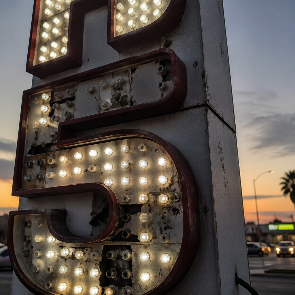
Walk down any major retail strip in Gauteng and you will spot them within minutes: faded fascia boards with peeling vinyl, channel letters where half the LED modules have blown, pylon signs that face the wrong direction entirely. Signage mistakes in South Africa are alarmingly common, and most of them are entirely avoidable. The frustrating part is that bad business signage does not announce itself loudly. It simply bleeds foot traffic and brand credibility quietly, day after day, while management focuses on everything else. This guide names the specific mistakes South African businesses repeat most often, explains exactly why they cost money, and shows how to fix them before they cost you customers.
Table of Contents
- Quick Takeaways
- Mistake 1: Choosing the Wrong Size for the Location
- Mistake 2: Ignoring Corporate Identity Standards
- Mistake 3: Poor Font and Colour Choices That Kill Readability
- Mistake 4: Installing Signs Without Municipal Approval
- Mistake 5: Using the Wrong Materials for the South African Climate
- Mistake 6: Neglecting Sign Maintenance Until It Is an Emergency
- Signage Approach Comparison
- Frequently Asked Questions
- References
Quick Takeaways
| Key Insight | Explanation |
|---|---|
| Size must match the viewing distance | A sign that looks fine in a design file can be completely unreadable from the road. Always test legibility at the actual installation distance before approving artwork. |
| CI compliance is non-negotiable for franchises | Franchise agreements specify exact colours, fonts, logo clearances, and materials. Deviating, even slightly, can trigger costly remedial work or legal action from the franchisor. |
| Low contrast is invisible signage | Light text on a light background, or dark text on a dark background, disappears at speed. High contrast between text and background is the single biggest readability lever you have. |
| Municipal approval is legally required for most outdoor signs | Johannesburg, Tshwane, and other metros require written applications and structural certificates for permanent outdoor advertising. Unapproved signs can be removed at the owner's cost. |
| South African UV destroys cheap substrates fast | Vinyl, acrylics, and print materials not rated for outdoor UV exposure fade and crack within months in Gauteng's climate. Specify outdoor-grade materials every time. |
| Damaged signs actively repel customers | A flickering LED sign or a cracked lightbox signals neglect. Customers read poor sign maintenance as a proxy for poor product or service quality. |
| One message per sign wins every time | Overcrowded signs with multiple messages, phone numbers, websites, and slogans cause cognitive overload. Pedestrians and drivers have seconds to absorb your message. Give them one clear action. |
Mistake 1: Choosing the Wrong Size for the Location
This is the mistake that hurts quietly. A business owner approves a sign based on how it looks in a PDF mockup on a laptop screen, and then discovers after installation that the lettering is impossible to read from the pavement or the road. The problem is spatial: screens compress real-world scale, and no designer can fully simulate what 50 metres of distance, harsh midday glare, or moving traffic actually does to legibility.
The rule of thumb used by professional signage fabricators is that for every 10 metres of viewing distance, letter height should be at least 25 millimetres. A pylon sign visible from 100 metres of road approach therefore needs letter heights of at least 250mm to be reliably readable. Most businesses undersize by a significant margin because they are designing for aesthetics rather than engineering for visibility.
The fix is practical, not expensive. Before signing off on artwork, print the design at scale and view it from the intended viewing distance. Better still, work with a signage supplier like SignShopper's custom signs team who conducts a proper site survey before specifying dimensions. Site surveys account for viewing angles, obstructions, competing visual noise, and the speed of passing traffic, all of which affect how large your sign actually needs to be.
The reverse error happens too. Signs that are vastly oversized for their immediate context look out of place and can actually reduce brand credibility. A reception fascia sign that dominates the entire wall of a boutique hotel lobby, for example, feels aggressive rather than welcoming. Scale is always contextual.
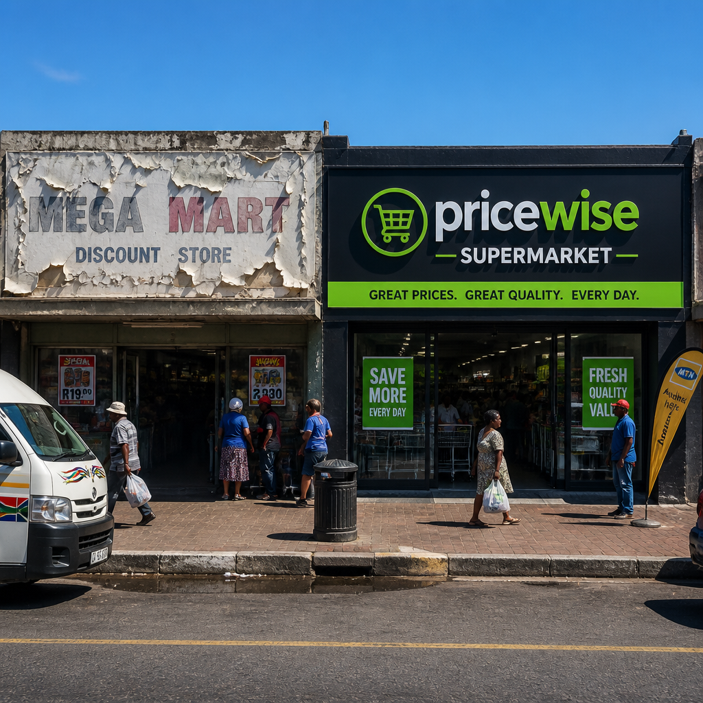
Pro tip: For street-facing signs on busy Gauteng arterials, brief your signage supplier on the average vehicle speed on that road. A sign on a 60 km/h residential road can carry more detail than one on an 80 km/h urban arterial, where drivers have roughly half the reading time.
Mistake 2: Ignoring Corporate Identity Standards
For corporate clients and franchise operators, this is the most commercially damaging mistake of all. A brand's corporate identity manual exists for a very specific reason: it ensures that every physical expression of the brand, from a business card to a 10-metre pylon sign, communicates one unified identity. When signage deviates from those standards, even in small ways, the brand's visual equity erodes.
What CI Deviation Actually Looks Like in Practice
CI deviation is rarely dramatic. It is usually subtle. A franchisee uses a slightly different shade of the brand red because the vinyl supplier did not have the exact Pantone colour in stock. A branch manager approves an illuminated sign where the logo clearance zone is half of what the CI manual specifies, because the sign company did not request the brand guidelines. An event display banner gets made with the old logo because no one checked whether the brand had refreshed its identity.
Each instance looks minor in isolation. Collectively, across multiple branches or events, these deviations compound into a fragmented brand presence that customers register, even if they cannot articulate why the brand feels slightly off. For South African franchise networks competing in crowded retail environments, brand recognition is a primary competitive asset.
The Franchise Compliance Dimension
For franchise operators, CI compliance in signage is not optional, it is contractual. Most franchise agreements in South Africa include explicit signage standards covering approved suppliers, specified materials, colour references, minimum dimensions, and installation requirements. Franchisees who deviate from those standards face formal compliance notices, required remediation at their own cost, and in persistent cases, legal consequences.
Working with a signage partner that actively requests and works within CI documentation is the only way to stay compliant. SignShopper specialises in franchise signage with strict CI adherence, meaning the brand guidelines are treated as the brief, not as a suggestion. When you are rolling out signage across multiple locations, that discipline is what keeps a national network looking like a national brand.
A sign should feel like part of the same brand people see on the website, printed material, staff clothing, or reception desk. Colour, logo spacing, wording, and finish all influence whether the sign feels planned or separate from the rest of the business.
Mistake 3: Poor Font and Colour Choices That Kill Readability
Readability is an engineering problem, not a taste problem. Yet South African businesses routinely make font and colour decisions based on aesthetics alone, and then wonder why their signage generates no walk-in traffic. The core issue is that a sign is read under real-world conditions: changing light, moving viewers, competing visual noise, and often only a few seconds of attention.
Decorative script fonts, condensed typefaces, and fonts with very thin strokes all perform poorly at distance, particularly when combined with substrates that catch glare. The same applies to low-contrast colour combinations. A dark green background with navy text, or a pale gold logo on a white panel, may look sophisticated in a design application but will be effectively invisible in direct afternoon sunlight.
High contrast between the text and background is not a design compromise, it is the fundamental requirement for outdoor signage. Black on white, white on navy, white on deep red, and similar combinations work because the human eye distinguishes them rapidly. Test any proposed colour combination in strong direct light before approving it for production.
Overcrowding is a related problem. Businesses try to include their trading name, slogan, phone number, website, product categories, and social media handle on a single fascia sign. The result is that nothing is read, because the eye has no entry point. For most business signs, one primary message is the maximum. Every additional element reduces the effectiveness of all the others.
Pro tip: If your sign includes a phone number, test whether a driver travelling at the speed limit on the road in front of your premises could realistically read and retain it. If the answer is no, remove the number from the outdoor sign and put it where customers can find it when they are already engaged: on your storefront window, your menu, or your counter display.
Mistake 4: Installing Signs Without Municipal Approval
This mistake is astonishingly common, and the consequences are severe. In South Africa's major metros, including Johannesburg and Tshwane, the installation of outdoor advertising structures requires prior written approval from the relevant municipality. This applies to permanent signs affixed to buildings, freestanding structures, pylon signs, and in many cases, large temporary banners displayed on public-facing facades.
The Johannesburg Metro's outdoor advertising bylaws require applicants to submit a site plan, detailed sign drawings, and a structural safety certificate confirming the sign's engineering integrity. Signs displayed without this approval can be removed by the municipality, with the cost of removal charged to the owner. There is no grace period and no advance warning required before removal in cases of non-compliance.
Beyond removal risk, unapproved signs create liability. If an unapproved sign structure fails and causes damage or injury, the business that installed it carries full liability exposure, without the protection that a properly certified structural submission would have provided.
The practical solution is to work with a signage supplier who handles the approval process as part of the project scope. This means the supplier manages the municipal submission, coordinates the structural engineer's certificate, and ensures the installed sign meets the bylaw specifications for height, setback from traffic intersections, maximum luminance for illuminated signs, and other technical requirements. It adds time to the project, typically several weeks for municipal processing, so factor this into your timeline at the brief stage, not as an afterthought after you have already committed to a launch date.

Mistake 5: Using the Wrong Materials for the South African Climate
South Africa's climate, particularly on the Highveld, is hard on signage materials. Gauteng experiences intense UV radiation, significant temperature swings between summer and winter, and regular hail events. The Western Cape's coastal areas add salt air to the equation. Materials that perform adequately in a mild European or North American climate can degrade very rapidly under these conditions.
The UV Problem
Standard calendered vinyl, which is the cheaper option used widely in short-term promotional printing, is not rated for extended outdoor use in high-UV environments. When applied to an external fascia in Gauteng and left for 18 months, it will yellow, bubble, and peel. This is not a production fault, it is a material specification error. The correct specification for permanent outdoor vinyl applications is cast vinyl with a UV-protective laminate, which maintains colour and adhesion over a significantly longer service life.
Acrylic and Substrate Selection
Acrylic panels used in lightboxes and LED-backlit signs must be UV-stabilised. Standard acrylic yellows under sustained UV exposure, which changes the colour rendering of any internal illumination and degrades the appearance of the sign rapidly. Outdoor-grade UV-stabilised acrylic costs more upfront but outlasts the cheaper alternative by several years. For LED screen installations, the IP rating of the cabinet matters enormously. An IP65-rated enclosure provides adequate protection against dust and direct water spray, which is the minimum acceptable specification for any permanently outdoor-mounted display in South Africa.
Structural Durability in Wind and Hail
Freestanding banner frames and display stands used for outdoor events must be rated for the wind loads typical of South African conditions. Lightweight promotional frames that work perfectly in a sheltered indoor exhibition are a liability at an outdoor event in Johannesburg, where afternoon thunderstorm winds can arrive with very little warning. Properly weighted and braced A-frame stands cost more to rent or purchase, but they do not blow into customers or damage surrounding property.
Mistake 6: Neglecting Sign Maintenance Until It Is an Emergency
A sign that looked sharp on installation day starts degrading the moment it is exposed to weather, pollution, and time. In South African urban environments, signs accumulate road dust and grime quickly. Illuminated signs develop LED module failures. Channel lettering fills with insect debris that blocks the light output. Vinyl graphics develop edge lifting where adhesion has weakened.
Most businesses have no maintenance schedule for their signage. They respond reactively: a sign gets attention only when it becomes so obviously damaged that it is embarrassing. By that point, the sign has been quietly repelling customers and undermining brand credibility for months.
The business case for proactive maintenance is straightforward. A regular inspection and cleaning schedule, combined with prompt replacement of failed LED modules or damaged panels, costs a fraction of what emergency remediation or full sign replacement costs. More importantly, it ensures the sign is always doing its job: attracting customers rather than communicating neglect.
For multi-branch businesses and franchise networks, a brand audit process, which involves a systematic inspection of signage across all locations, is the professional approach. This identifies not only maintenance issues but also CI drift, unauthorised modifications, and signs that are due for replacement before they become a liability. SignShopper provides national project management and brand audits across South Africa, Botswana, Zimbabwe, and Mozambique, making this practical even for networks with geographically distributed branches.
Pro tip: Schedule a signage inspection at the same time as your annual fire equipment check. Both happen once a year, both affect safety and compliance, and linking them means neither gets forgotten during the operational year.
Signage Approach Comparison
Not all approaches to business signage produce the same outcomes. The table below compares the three most common approaches South African businesses take, from reactive and under-resourced to properly managed.
| Approach | What It Looks Like in Practice | Real-World Outcome |
|---|---|---|
| Reactive and DIY | Signs ordered cheaply online or from the nearest print shop without a site survey, CI brief, or municipal approval. Maintenance only happens when the sign is already embarrassing. | Short lifespan, CI non-compliance, municipal risk, and consistent brand fragmentation across branches. High total cost over time. |
| Ad hoc with occasional professionals | A professional supplier is used for the main fascia but other signs (event banners, window graphics, interior wayfinding) are sourced separately without a unified brief. | Inconsistent quality and brand feel across touchpoints. Signs look disconnected from each other. Moderate cost, moderate risk. |
| Managed, CI-led signage programme | A single supplier with CI documentation manages all signage types: outdoor, interior, event, and rental. Site surveys, municipal approvals, and maintenance schedules are part of the scope. | Consistent brand presence, compliance confidence, longer sign lifespan, and lower total cost of ownership. The correct approach for franchises and multi-branch businesses. |
Frequently Asked Questions
Do I need municipal approval for a simple window graphic or fascia sign in South Africa?
It depends on the municipality and the type of sign. In Johannesburg and Tshwane, permanent fascia signs and freestanding structures generally require formal approval and a structural certificate. Window graphics that do not cover more than a specified percentage of the glazed area are often exempt, but you should confirm this with your municipality or work with a signage supplier who knows the local bylaws before installation.
How do I know if my sign is CI-compliant if I have lost access to the brand guidelines?
Contact your franchisor's marketing or operations department directly and request the current brand guidelines document. For corporate clients with an in-house design function, the brand or marketing team holds the CI manual. Never instruct a signage supplier to match an existing sign by eye, as existing signs may themselves be non-compliant or may have faded from their original specified colour.
What is the minimum letter height for a sign that needs to be readable from a passing car?
A commonly used industry guideline is 25mm of letter height per 10 metres of viewing distance. For a sign needing to be read from 80 metres away, that means a minimum letter height of 200mm. Factors like typeface weight, contrast, background complexity, and ambient light all affect real-world performance, which is why a site survey before artwork sign-off is the professional standard.
Is it worth renting signage rather than buying for a short-term event or pop-up?
Yes, in most cases. Purchasing high-quality display stands, banner frames, and LED displays outright for a single event or short-term activation rarely makes financial sense. Rental gives you access to well-maintained, current equipment without the storage, maintenance, and capital cost burden. For businesses operating across multiple South African cities or into neighbouring markets, rental through a national provider also solves the logistics problem of transporting equipment.
How often should permanent outdoor signage be inspected and maintained?
A minimum of once a year is the baseline, but in high-pollution environments like Johannesburg's northern suburbs or coastal locations, twice yearly is more appropriate. Illuminated signs, especially those using LED modules in channel lettering or LED-backlit lightboxes, benefit from a quick functional check every six months to catch module failures before they become obvious to customers. After any severe hail event, an immediate structural inspection is advisable.
Can bad signage actually cost a business measurable revenue?
Yes. Signage is often the first physical interaction a potential customer has with a business. A sign that is unreadable, damaged, or visually inconsistent with the brand creates an immediate negative impression that many potential customers will not look past. For retail businesses that depend on walk-in traffic, poor signage directly reduces footfall. For franchises, non-compliant or damaged signage can affect the entire network's brand perception, not just the individual branch.
Have you spotted a particularly bad signage mistake at a South African business, or do you have a win to share from fixing your own signage? Leave a comment below and let us know what made the difference.
References
- Top signage mistakes that cost businesses customers, with practical fixes for each
- Overview of business signage types and brand consistency principles in South Africa
- City of Johannesburg revised outdoor advertising bylaws and structural requirements
- Seven common signage mistakes new business owners make and how to avoid them