


Gym Signage South Africa: Build an Energising Brand
Most gym owners spend serious money on equipment, flooring, and lighting, then treat signage as an afterthought. The result is a facility that looks generic from the street, confuses new members inside, and fails to create the charged, branded atmosphere that keeps people coming back. Gym signage in South Africa is not a decorative extra. It is the single fastest way to turn a functional workout space into a brand environment that members photograph, share, and recommend. Whether you run a single-location boutique studio in Midrand or manage a franchise network with ten sites across Gauteng, the signage decisions you make today either reinforce your identity or quietly undermine it.
Table of Contents
- Quick Takeaways
- Why Gym Signage Matters More Than You Think
- Exterior Signage: Make the First Impression Count
- Interior Branding: From Entrance to Changing Room
- Signage Types That Work Hardest in Fitness Environments
- Wayfinding and Safety Signage: The Operational Backbone
- Franchise and Corporate Identity: Keeping Every Location On-Brand
- Signage Comparison: Choosing the Right Approach for Your Facility
- Frequently Asked Questions
- References
Quick Takeaways
| Key Insight | Explanation |
|---|---|
| Exterior signage sets member expectations before they walk in | An illuminated fascia or channel letter sign tells the street your facility is professional. A flat, vinyl-printed board tells them it is temporary. |
| LED neon flex suits the gym environment particularly well | It handles heat, humidity, and vibration better than glass neon. It is cost-effective for logo displays and motivational phrases on interior walls. |
| Every zone in your gym needs its own signage layer | Cardio floor, free weights, group fitness studio, reception, and changing rooms each have different audiences and different messaging needs. |
| Franchise gyms must standardise wayfinding across all locations | Consistent directional and zone signs mean a member at your Centurion branch feels as at home as they do at your Sandton location. |
| Backlit acrylic at reception creates an immediate tone shift | A backlit logo panel above the front desk signals quality and professionalism in the first three seconds of a member's visit. |
| Do not over-illuminate the workout floor | Too many bright illuminated signs on the training floor create visual fatigue. Reserve lit signage for focal points; use flat 3D lettering for zone markers. |
| Wellness centres require a different visual temperature than hardcore gyms | Spa and yoga studios need softer lighting, muted tones, and tactile materials like brushed aluminium or frosted acrylic, not high-contrast neon. |
Why Gym Signage Matters More Than You Think
A gym is one of the few commercial environments where the customer spends 45 to 90 minutes inside on every visit. That sustained dwell time means your signage is not a single impression, it is a repeated experience. Every sign your member passes on their way from the car park to the squat rack either builds brand equity or erodes it.
There is a practical dimension too. Fitness centre signs in Gauteng have to work under demanding physical conditions: elevated humidity in changing rooms, vibration from heavy equipment, strong artificial lighting that washes out low-contrast graphics, and the constant movement of members who need clear directional cues without being stopped in their tracks. Generic signage solutions built for retail or office environments simply do not hold up.
The most common mistake gym owners make is treating signage as a one-time fit-out cost rather than a core element of the member experience. A poorly placed sign, a faded banner, or a reception logo that has yellowed under UV light signals to prospective members that the facility is not maintained. That perception spreads long before a bad review ever appears online.
Exterior Signage: Make the First Impression Count
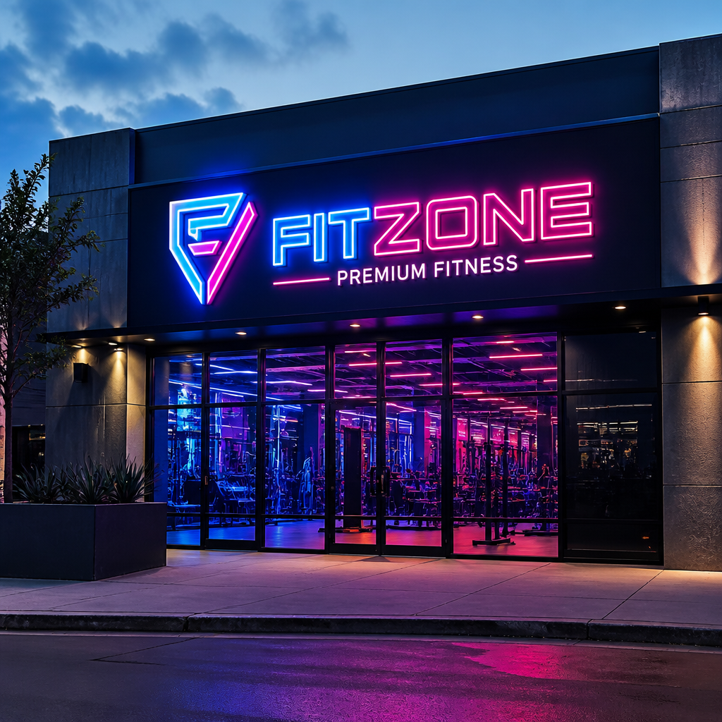
Your building facade is your highest-value signage real estate, and most gym owners underuse it. The goal of exterior gym signage is not just to identify the location. It is to communicate energy, credibility, and scale to anyone who drives past, even at speed and even at night.
Channel Lettering and Fascia Signs
Channel letter signs are individually fabricated three-dimensional letters, typically aluminium with an LED-illuminated face. They are the standard for gyms that want to project permanence and professionalism. Front-lit channel letters in your brand colours are visible from a considerable distance after dark, which matters for early-morning and late-evening sessions that make up a large portion of gym traffic.
Halo-lit (reverse-lit) channel letters, where light radiates from behind the letter onto the wall rather than through the face, create a premium backlit glow that reads particularly well for wellness and spa facilities aiming for a more refined aesthetic. For a gym in a retail park or alongside a major road, standard front-lit channel letters in a bold brand colour will always outperform halo-lit in pure visibility.
Pylon and Totem Signage
If your gym sits in a complex, a business park, or set back from the road, a pylon or totem sign at the entrance is not optional. Passers-by navigating to you for the first time cannot find a sign they cannot see from the road. Illuminated pylon signs with your logo and facility name eliminate that problem entirely and extend your visible footprint far beyond your building's frontage.
Pro tip: If you are in a shared building complex, negotiate for the largest panel allocation on the complex pylon sign. In high-footfall areas, visibility on that pylon drives walk-in enquiries more reliably than most digital marketing spend.
Interior Branding: From Entrance to Changing Room
Interior gym signage needs to do two jobs simultaneously: it must reinforce brand identity at every touchpoint, and it must guide members through the facility without creating confusion or clutter. These two goals can conflict if you plan them separately. The smart approach is to map the member journey from car park to workout floor to changing room, and then assign signage roles to each stage of that journey.
Reception and Entrance Area
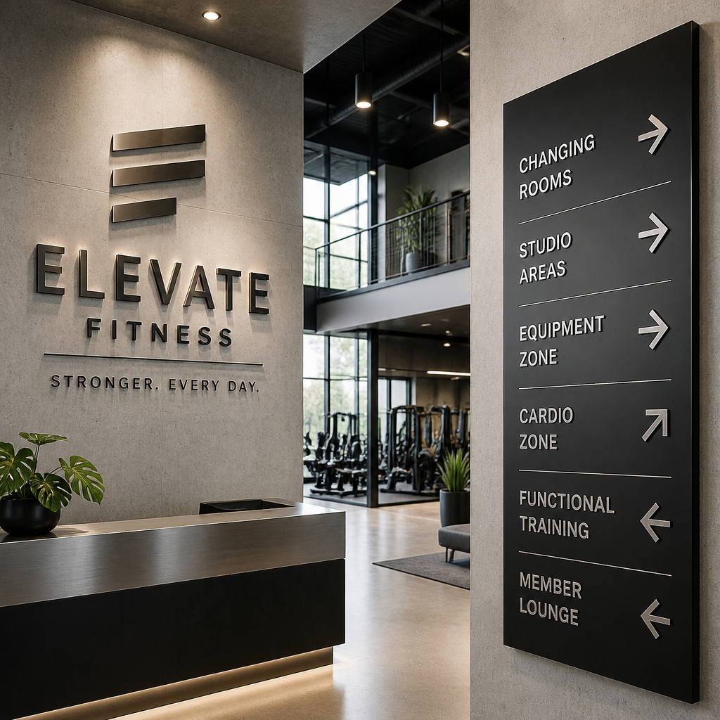
The reception desk is where your wellness brand signage makes or breaks its first interior impression. A backlit acrylic logo panel above or behind the desk is the single most cost-effective upgrade you can make to this space. It creates immediate visual focus, looks professionally finished, and photographs well, which matters because members and guests will take photos at reception. Combine it with 3D cut-out lettering in brushed aluminium or painted steel on the adjacent wall for a layered, dimensional effect that photographs as a strong brand statement.
Workout Floor and Zone Markers
The training floor is where members spend most of their time and where motivational signage has its greatest impact. The key is restraint. Do not cover every wall with typographic prints. Instead, identify two or three focal points where members naturally direct their gaze during rest periods, typically the wall facing the main cardio equipment, the mirror wall in the free weights area, and the entrance to group fitness studios.
At those focal points, a combination of large-format wall decals, custom 3D lettering, and selectively placed LED neon flex creates an energised environment without visual overload. Zone markers for the cardio area, weights floor, and functional training space should be clear and consistent in font and colour, serving as both wayfinding cues and brand reinforcement.
One approach that works well in practice is to use your brand's primary colour in the zone markers and a neutral (white or black) for motivational wall text. This creates a visual hierarchy that keeps the space legible rather than chaotic.
Group Fitness Studios
Group fitness studios are high-energy spaces that deserve dedicated signage treatment. The ceiling is a frequently overlooked surface. Projecting signage, hanging banners, or even a row of custom LED strips along the ceiling perimeter can transform a plain room into an immersive brand space. For spin and HIIT studios, bold colour-coded lighting combined with a neon flex logo on the front wall creates the kind of atmosphere members photograph and post.
Changing Rooms and Wet Areas
The changing room is the last branded touchpoint before a member leaves your facility. It is also the most frequently neglected. Branded motivational messaging, clear etiquette signage in your brand font and colour, and a backlit acrylic logo above the vanity mirrors all signal that the attention to detail does not stop at the workout floor. In wet areas, use materials rated for moisture exposure and select mounting solutions that will not corrode or peel from humidity over time.
Signage Types That Work Hardest in Fitness Environments
Not every signage product is equally suited to a gym or wellness environment. The physical demands of the space, the brand register you are projecting, and the budget available all influence the right choice. Here is a direct assessment of the types that deliver the most value in this context.
LED Neon Flex Signs
LED neon flex is the most versatile interior signage option for fitness facilities. Unlike traditional glass neon, it does not shatter if knocked, handles vibration well, runs cooler, and consumes significantly less power. For a gym, it is ideal for logo displays at reception or in group fitness studios, motivational phrases on the workout floor, and feature wall elements in studio photography corners that members use for social content.
The brightness and colour options available with LED neon flex mean it adapts equally well to a high-energy commercial gym aesthetic and a softer wellness centre environment. A single LED neon sign with your studio name above the reception desk costs a fraction of a full illuminated fascia sign but generates a disproportionate amount of brand recall and social content from members. You can explore custom neon sign options to get a sense of what this looks like in practice.
Backlit LED Signs and Light Boxes
LED-backlit signs are the workhorses of gym branding. A slim-profile backlit panel carrying your logo at reception, behind the smoothie bar, or above the entrance to a premium studio area creates a clean, premium look that holds up well in high-ambient-light environments. Light boxes are also practical for displaying class schedules, membership offers, or promotional content that changes periodically, since the printed face can be swapped without replacing the entire unit.
3D Channel Lettering and Dimensional Signs
For outdoor fascia signs and major interior feature walls, channel lettering offers the best combination of impact, durability, and brand precision. Three-dimensional letters in powder-coated aluminium or fabricated steel carry more visual weight than flat-printed graphics and read well from distance. On an interior wall, non-illuminated 3D lettering in brand colours creates a tactile, premium effect that distinguishes a professionally fitted gym from one that used a print shop.
Large-Format Wall Decals and Vinyl Wraps
Wall decals and vinyl wraps are the highest surface-area-to-cost option available. A full-wall mural behind the free weights area, a floor-to-ceiling brand graphic at reception, or a motivational typographic panel on the cardio wall can transform the visual character of a room for a relatively modest investment. In practice, they work best as a background layer behind dimensional signage, not as the primary brand statement on their own.
Pro tip: When specifying wall decals for a gym, always request a material rated for high-traffic and moisture-resistance. Standard indoor vinyl degrades quickly in changing rooms and near showers. A slightly more expensive cast vinyl with a laminate finish will last three to five times longer in those environments.
Wayfinding and Safety Signage: The Operational Backbone
Wayfinding is the unglamorous half of gym signage, but it has a direct impact on member satisfaction and, for franchise groups, on legal compliance. A new member who cannot find the changing rooms, the emergency exit, or the equipment storage creates friction from their very first visit. That friction is entirely avoidable with well-designed directional signage.
For fitness centre signs in Gauteng, directional signs should be mounted at eye level at every decision point: the entrance lobby, any corridor junction, the entrance to changing rooms, and near emergency exits. Use consistent iconography and font across all wayfinding elements, matched to your brand typography where possible, so the signs feel designed rather than retrofitted.
Safety signage in a gym context covers emergency exits, fire equipment locations, equipment usage instructions, and wet floor warnings. These have specific legal requirements in South Africa under occupational health and safety regulations. Do not attempt to incorporate safety signs into your brand design to the point where the regulatory content becomes ambiguous. Keep safety signs compliant in format and supplement them with branded etiquette and usage signs that carry your visual identity.
A gym member who cannot find the locker room on their first visit will remember that confusion long after they have forgotten their best workout. Wayfinding is not an afterthought - it is the infrastructure of a good member experience.
Franchise and Corporate Identity: Keeping Every Location On-Brand
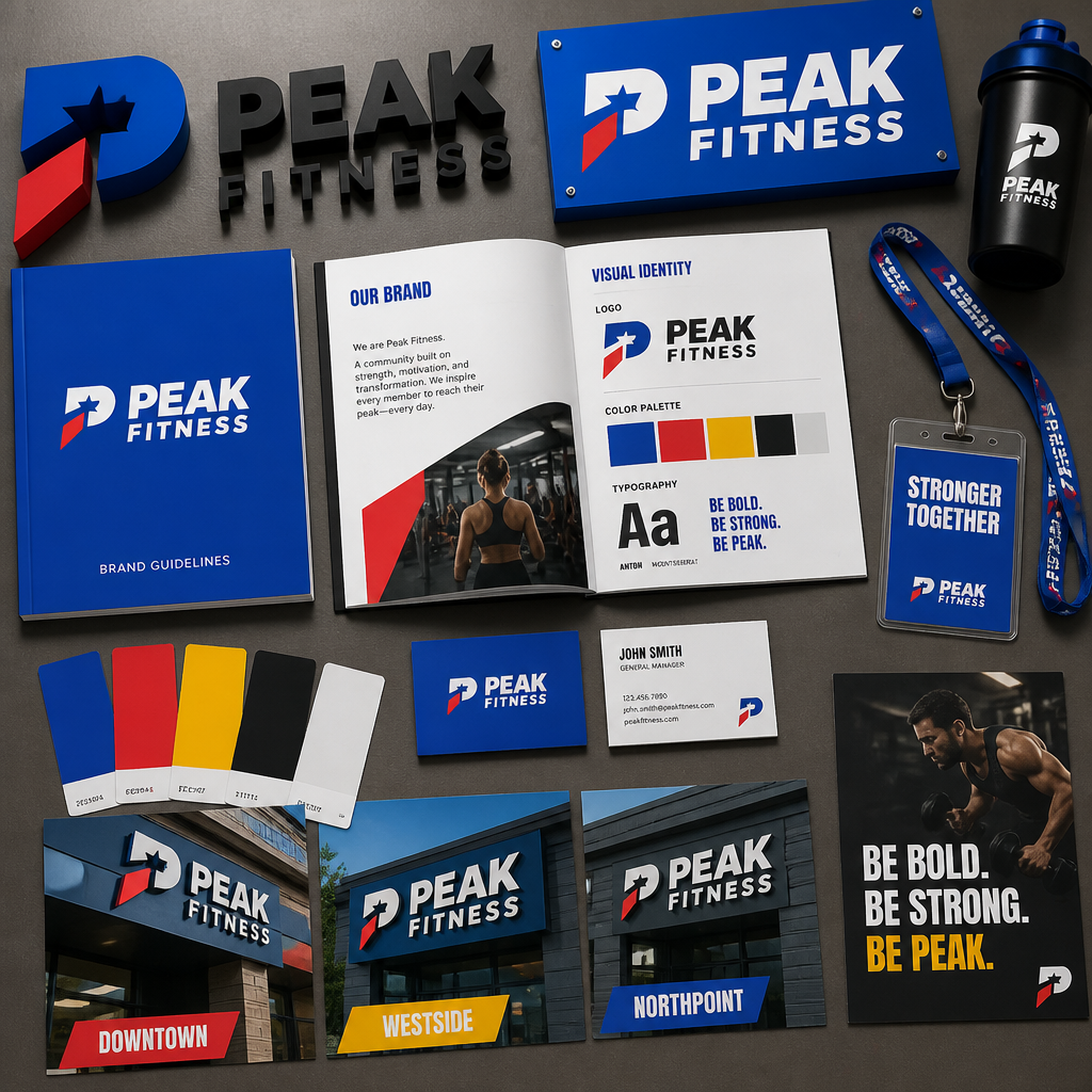
For fitness franchise groups operating across Gauteng or multiple provinces, signage consistency is not just a branding preference. It is a contractual obligation and a competitive asset. A member who joins at your Pretoria branch and visits your Johannesburg location expects to recognise the same visual language: the same logo treatment, the same zone colours, the same wall typography style. When that consistency breaks down, it signals to the member that quality control is inconsistent, and that concern extends beyond the signs.
The practical challenge for franchise groups is that individual franchisees often source signage locally to save costs, resulting in colour drift, font substitutions, and format variations that slowly erode the national brand. The solution is to work with a single signage partner who maintains your brand specification files and produces to a controlled standard across all locations. SignShopper's corporate identity adherence process is specifically designed to address this problem for franchise clients.
A common mistake in franchise gym fit-outs is treating the brand guidelines document as a sufficient control. In practice, guidelines only work if the supplier producing the physical signs has the actual artwork files, the correct Pantone or RAL colour references, and the material specifications to match them. Without that, a franchisee's local printer will make substitutions that look close enough on screen and wrong enough in person to matter.
Pro tip: For multi-site franchise roll-outs, ask your signage supplier to produce a physical sample set of every sign type before full production begins. One approved sample set held at head office becomes the reference standard for every subsequent installation and eliminates colour and quality disputes at the local level.
Signage Comparison: Choosing the Right Approach for Your Facility
Different facility types have different signage priorities. The table below compares three common gym and wellness scenarios against the signage approach that delivers the best outcome in each.
| Facility Type | Best Signage Approach | Key Considerations |
|---|---|---|
| High-energy commercial gym (e.g. large box gym or franchise) | Illuminated channel letter fascia sign, bold LED neon flex on interior feature walls, floor decals for zone marking, standardised wayfinding set | Prioritise visibility from the road; maintain brand consistency across zones; use robust materials that withstand heavy foot traffic and vibration from equipment |
| Boutique fitness studio (e.g. cycling, HIIT, pilates, yoga) | Backlit acrylic logo at reception, LED neon flex brand sign in studio space, dimensional 3D lettering on a feature wall, minimal wayfinding with branded icons | Photography corner with a neon flex sign drives organic social content; keep the aesthetic tight and cohesive; fewer, higher-quality signs outperform many cheap ones |
| Wellness and spa centre | Halo-lit channel lettering or frosted backlit panels externally, brushed aluminium dimensional lettering internally, soft-tone LED panels, tactile material choices throughout | Avoid high-contrast neon or strobe-capable lighting; the visual register should communicate calm and premium quality; every sign material and finish should reinforce the brand's positioning |
Frequently Asked Questions
What types of signs work best for the exterior of a gym in South Africa?
For a freestanding gym building, illuminated channel letter fascia signs are the most effective exterior option. They are visible after dark, project dimensional brand presence, and hold up well in the South African climate. If your facility is set back from the road or located within a complex, an illuminated pylon or totem sign at the entrance road is essential for guiding new members. Lightboxes and projecting signs are good secondary options for smaller or more constrained facades.
How much should a gym budget for signage during a new fit-out?
There is no standard figure that applies across all facility sizes and types, and any supplier who quotes a percentage of fit-out cost without seeing your specific brief is guessing. In practice, the minimum effective spend covers an exterior fascia sign, a reception logo panel, zone markers for each training area, and a basic wayfinding set. Feature wall treatments and neon flex installations are an additional layer that significantly upgrades the member experience but can be phased in after opening. Request an itemised quotation based on your actual floor plan and brand requirements rather than working from a generic estimate.
Is LED neon flex a good option for a wellness centre, or does it look too harsh?
LED neon flex is available in a wide range of colour temperatures, including warm whites, soft pinks, and muted tones that suit a wellness or spa aesthetic without appearing harsh. The key is the colour selection and the placement. A single neon flex sign in a warm neutral tone above a reception desk or in a treatment corridor reads as a premium design element rather than a nightclub fixture. Avoid high-saturation colours like bright red or electric blue in wellness environments. Stick to your brand palette and choose a neon flex colour that sits within it.
How do franchise gyms keep signage consistent across multiple Gauteng locations?
The most reliable approach is to appoint a single preferred signage supplier who holds your master artwork files and brand specifications and produces all location signage to that standard. This eliminates the colour drift and format variation that occurs when individual franchisees source locally. A physical sample set approved by head office before roll-out serves as the production reference standard. Any supplier claiming to offer franchise-grade consistency should be able to demonstrate how they manage artwork version control and production tolerances across multiple jobs.
What is the difference between a backlit sign and a channel letter sign for gym reception areas?
A backlit sign is a flat panel where the light source sits behind a printed or cut graphic face, creating an even, glowing effect. A channel letter sign is a set of individually fabricated three-dimensional letters, each with its own LED light source inside. At reception, a backlit panel is the more common and cost-effective choice for logo display. Channel letters add more dimensional impact and are more commonly used on exterior facades. For interiors, either option works well depending on your brand aesthetic. Backlit panels suit a clean, minimal look. Dimensional channel letters suit a bolder, more industrial or high-energy brand register.
Can SignShopper produce signage for a gym opening or rebranding on a tight timeline?
Tight timelines are a routine part of gym fit-out and rebranding projects, particularly for franchise roll-outs with committed opening dates. The critical factor is having your artwork and brand files ready before production begins. Delays in signage projects almost always trace back to incomplete or unapproved artwork, not production capacity. Engage your signage supplier as early as possible in the fit-out process, share your brand guidelines and preferred materials upfront, and build at least one round of physical proofing into your timeline. Attempting to compress production at the end of a project by skipping proofing is a reliable way to receive signage that does not match your expectations on installation day.
If you have recently rebranded your gym or wellness centre and have thoughts on what worked (or what you would do differently) with your signage, we would genuinely like to hear your experience.
References
- Essential gym signage ideas covering branding, safety, and wayfinding in fitness facilities
- Overview of gym sign types from exterior fascia options to interior wall decals and dimensional signs
- How consistent signage supports franchise gym brand identity and member experience across multiple locations
- How custom neon signs are used to brand gym and fitness studio environments
- Gym branding and design ideas for creating a premium member experience through exterior and interior signage