


Colour Psychology in Signage: Drive Customer Behaviour
Walk through any busy Gauteng retail park and pay attention to what makes you stop, look, or walk past a storefront. Chances are it is not the business name you read first. It is the colour of the sign. Colour psychology in signage South Africa is not a design nicety; it is one of the most direct, measurable levers a business has over first impressions and customer behaviour. Before a prospect reads a single word on your pylon sign, banner, or channel lettering, their brain has already formed an emotional verdict based on colour alone. For corporate businesses, franchise operators, and hospitality venues, getting that verdict right is not optional. It is what separates signage that earns its cost from signage that simply exists.
Table of Contents
- Quick Takeaways
- Why Colour Works Before Words Do
- The Key Colours in Signage and What They Do to Customers
- Colour in a South African Context: What Changes Locally
- Signage Types and Colour Application
- Colour Consistency and Corporate Identity in Franchise Signage
- Comparison: Warm versus Cool Colour Palettes in Commercial Signage
- Common Colour Mistakes in Business Signage
- Frequently Asked Questions
- References
Quick Takeaways
| Key Insight | Explanation |
|---|---|
| Colour is processed before text | A customer forms an emotional response to your signage colour before reading a single word. That response shapes whether they engage or move on. |
| Red drives urgency; blue builds trust | Red is most effective for promotional and clearance signage. Blue is the right choice for professional services, finance, and corporate environments where credibility matters. |
| South African audiences carry layered colour meanings | Colours carry cultural and historical weight in South Africa. A shade associated with liberation, land, or heritage can trigger a much stronger emotional response here than in a generic Western market context. |
| Contrast determines readability, not just aesthetics | A well-chosen brand colour on signage becomes invisible at distance if the contrast ratio between text and background is poor. Legibility and emotional impact must be designed together. |
| Franchise signage requires strict colour compliance | Inconsistent colour across franchise outlets erodes brand recognition. Every site, whether in Sandton or Polokwane, must reproduce the same approved Pantone or print specifications. |
| Illumination changes how colour reads | LED-backlit signs shift colour temperature after dark. A colour that reads correctly in daylight can appear different at night if the backlight is not specified and tested correctly. |
| Industry norms create colour expectations | Hospitality brands commonly use warm, welcoming tones. Health and wellness venues favour green and blue. Deviating too far from sector expectations creates subconscious friction for the customer. |
Why Colour Works Before Words Do
The human visual system processes colour faster than it processes text or shape. This is not a matter of opinion; it is the reason colour is the single most powerful element in exterior and interior signage design. Signage colour choices set the emotional tone of an entire customer interaction before the customer has even decided to approach your premises.
For a corporate office park entrance sign in Sandton, a retail shopfront in Rosebank, or a hotel fascia sign on the N1, the colour is performing a job every single moment the business is open. It is communicating authority, friendliness, affordability, exclusivity, or trust. The problem is that most businesses pick colours reactively rather than intentionally, defaulting to what "looks nice" or copying a generic industry colour without understanding why that colour works or whether it works for their specific audience.
The practical reality is that colour influences whether customers feel drawn into a space, whether they linger or rush, and whether a brand registers as premium or generic. For restaurants, the right colour on signage and interior display stands can influence how long guests stay. For a fitness centre, the wrong colour on a banner can undermine the energetic atmosphere the brand is trying to project before a member walks through the door.
A colour palette that works for a corporate law firm will not always work for a café, a youth brand, or a local service company. The best result comes from choosing a small, deliberate palette and using it consistently across all brand touchpoints.
The Key Colours in Signage and What They Do to Customers
Understanding what each colour actually does to a viewer is the starting point for every good signage brief. This is not about subjective preference. Behavioural psychology consistently identifies specific emotional and cognitive associations with individual colours, and those associations directly shape customer behaviour signage outcomes.

Red: Urgency, Appetite, and Attention
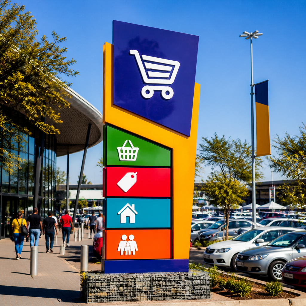
Red is the most attention-grabbing colour available in signage. It stimulates excitement and creates a sense of urgency, which is why it dominates promotional and clearance applications. Retail venues and food businesses that want to drive impulse decisions use red because it accelerates decision-making rather than encouraging contemplation. However, overusing red across an entire sign system creates visual fatigue and dilutes the urgency effect. It works hardest when used selectively, as a border, call-to-action element, or promotional accent rather than a full-sign colour.
Blue: Trust, Professionalism, and Calm
Blue is the dominant colour in corporate and professional service signage for a reason. Lighter blues create calm and approachability; bolder, deeper blues communicate authority and reliability. For financial services offices, law firms, or corporate campuses in Gauteng's commercial precincts, blue channel lettering or a blue-dominant fascia sign signals competence before any conversation has taken place. It is also effective in hospitality contexts where guest reassurance is a priority.
Green: Nature, Health, and Permission
Green communicates safety, freshness, and growth. It is the primary colour for health, wellness, and organic food brands, and it is also used in wayfinding because it is universally associated with "go" or "proceed." Fitness centres and spas often use green in their signage and display materials to reinforce the wellness message their brand is built around.
Yellow and Orange: Energy, Warmth, and Value
Yellow draws the eye quickly and communicates optimism and accessibility. It is frequently used in window display signage to pull attention from the street. Orange sits between red and yellow and projects enthusiasm and affordability, making it effective for value-oriented retail brands. Both colours are warm-tone signals that encourage action rather than deliberation.
Black and Deep Neutrals: Authority and Luxury
Black signage communicates premium positioning, authority, and sophistication. Hotels, upscale retail, and premium franchise brands use black as their primary sign colour precisely because it signals exclusivity. It pairs well with gold, white, or metallic finishes in channel lettering and dimensional signs to create a premium aesthetic that justifies higher price points in the customer's mind.
Colour in a South African Context: What Changes Locally
South Africa is not a monolithic market, and brand colour signage Gauteng decisions cannot be made as though the country has a single cultural colour vocabulary. South African brands operate across audiences with different cultural backgrounds, languages, and colour associations, and signage that works in one context can misfire in another.
Colour carries historical and cultural weight here that it does not carry in a generic Western marketing context. Certain colour combinations are read through the lens of the country's political and social history. For example, the black, gold, and green of liberation movements carry deep significance for a large portion of the South African population. Using these colours without understanding that resonance, or using them carelessly in a commercial context, can create unintended associations that either strongly connect or strongly alienate, depending on the audience and execution.
Earth tones, including ochre, terracotta, and deep gold, have strong cultural resonance across many South African communities and tend to read as warm, authentic, and locally grounded. They perform well in signage for businesses that want to communicate community connection or local heritage rather than international corporate distance.
Pro tip: If your business operates across multiple provinces or communities in South Africa, commission a small audience review of your proposed colour palette before committing it to permanent exterior signage. A colour that reads as trustworthy in one cultural context can read as inappropriate or even offensive in another. Fix it in the brief, not after fabrication.
For Gauteng-based businesses specifically, the commercial environment is highly competitive and visually saturated. In areas like Sandton, Midrand, and the East Rand retail corridors, differentiation through deliberate colour contrast matters more than following a safe industry default. A bold, well-justified colour choice in a sea of predictable blue-and-white corporate signs gets attention and holds it.
Signage Types and Colour Application
Different signage formats have different colour constraints and opportunities, and the right colour decision for a pull-up banner inside an exhibition hall is not the same as the right decision for an illuminated pylon sign visible from a busy arterial road.
Outdoor Pylon and Fascia Signs
These signs need to perform at distance, in full sunlight, and at night under artificial lighting. High colour contrast between background and text is non-negotiable for legibility at distance. A dark background with light lettering, or a highly saturated background with white channel lettering, consistently outperforms low-contrast combinations. Colour saturation appears more intense in direct Gauteng sunlight, so colours selected from a screen or print proof should always be signed off on a physical sample in outdoor conditions before production is approved.
LED-Backlit and Illuminated Signs
Illumination fundamentally changes how colour reads. A navy blue that looks rich and authoritative in daylight can read as a bright, almost-purple under warm LED backlighting after dark. Colour specifications for illuminated signs need to account for the light temperature of the LED source. This is a technical detail that is often overlooked in the brief but has a significant visual impact on how the brand reads in the evening hours when many retail and hospitality businesses see peak traffic.
Neon and Decorative Interior Signs
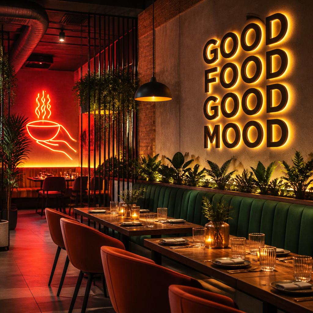
Neon signs have a specific emotional register: nostalgia, warmth, and personality. They work best when the colour choice reinforces the brand personality rather than just being decorative. A restaurant using a warm red or amber neon sign inside creates intimacy and appetite stimulation. A fitness brand using a bright white or blue neon creates energy and focus. The colour of a neon sign inside a space directly influences how long customers stay and how they feel while there.
Banners and Display Stands for Events
Event signage operates in a cluttered visual environment where colour is the fastest way to claim space. Bold, single-colour backgrounds with high-contrast typography outperform multi-colour, busy designs at events. For corporate events, colour discipline on banners and display stands is also a brand integrity issue. The marketing manager who allowed event banners to print in an off-brand pantone knows exactly what that inconsistency costs in professionalism.
Pro tip: Always supply your printer or signage fabricator with a Pantone Matching System (PMS) colour reference for every brand colour. "Dark blue" is not a colour specification. PMS 294 C is. The difference between those two instructions is the difference between consistent brand colour and an embarrassing mismatch between your signage, your printed collateral, and your digital presence.
Colour Consistency and Corporate Identity in Franchise Signage
For franchise operators and multi-site corporate businesses, colour consistency is not just an aesthetic preference. It is the mechanism by which brand recognition is built and maintained across every customer touchpoint. A customer who visits your Johannesburg outlet and then your Cape Town or Durban outlet should experience the same colour environment and form the same emotional response. When that consistency breaks down, so does the psychological familiarity that keeps customers choosing your brand over others.
The challenge in practice is that signage production across multiple sites, over time, and through different suppliers creates colour drift. A fascia sign produced in 2021 in Pretoria may not match a replacement panel produced in 2024 in Bloemfontein if the colour specification has not been locked down and enforced in every production brief. This is particularly visible with illuminated signs, where different LED batches can produce different colour temperatures even with the same specification.
Managing brand colour in franchise signage requires a documented corporate identity standard that specifies exact Pantone references, acceptable material finishes, and approved typographic weights for every sign type. Every fabrication job should reference that standard explicitly. Rental signage solutions for temporary or event-based brand presence carry the same obligation. A temporary banner at a franchise launch event that uses an off-brand red is still damaging to brand equity, even if it is only up for a weekend.
Comparison: Warm versus Cool Colour Palettes in Commercial Signage
| Characteristic | Warm Colour Palettes (Red, Orange, Yellow) | Cool Colour Palettes (Blue, Green, Purple) |
|---|---|---|
| Primary emotional effect | Urgency, excitement, energy, appetite stimulation | Trust, calm, professionalism, reassurance |
| Customer behaviour outcome | Faster decisions, impulse action, higher browsing speed | Longer dwell time, deliberate evaluation, brand trust |
| Best signage application | Retail sale signs, restaurant fascias, event banners, promotional display stands | Corporate fascia signs, hotel entrance signage, wellness and healthcare venue signage |
| Risk if overused | Visual fatigue, reads as cheap or aggressive in premium environments | Can feel cold or uninviting in hospitality or food contexts |
| Illuminated sign considerations | Red and orange intensify under warm LED; test in situ before approving production | Cool tones can shift toward grey or muted under incorrect LED temperature; specify colour temperature carefully |
| South African cultural resonance | Earth reds and gold carry strong local cultural warmth; used well, they communicate authenticity | Blue reads as internationally corporate; green connects to land, nature, and growth narratives |
Common Colour Mistakes in Business Signage
The most common and costly mistake in commercial signage colour is treating it as a final decision made in isolation rather than as part of a system. A colour chosen by a designer on screen, approved from a PDF proof, and then fabricated without physical sign-off in real-world lighting conditions will frequently disappoint on installation. The sign does not look wrong because someone made a bad choice; it looks wrong because the decision process skipped the verification steps that account for material, light, and viewing distance.
A second mistake is selecting too many colours for a single sign. More than two or three colours on a sign creates visual competition between elements and reduces the impact of each. The colour that should be doing the psychological work, driving urgency or communicating trust, gets diluted by competing hues. Discipline in colour palette size is a sign of a mature, confident brand. Visual noise is a sign of one that has not yet decided what it wants to say.
A third mistake, specific to the South African market, is defaulting to colour palettes developed for international or European markets without interrogating whether they translate locally. South African consumers are not a subset of a generic global market. They bring specific cultural references to colour that must inform the final colour brief, especially for businesses whose customers are primarily local rather than international.
Finally, businesses frequently underestimate the difference between a colour that looks correct on a digital proof and a colour that reads correctly on a printed or fabricated substrate. Vinyl, aluminium composite panels, and acrylic all absorb and reflect colour differently. A professional signage supplier that takes colour accuracy seriously will provide material samples and lit mockups before full production. That verification step is not optional for any business that cares about brand consistency.
Frequently Asked Questions
What is the most effective colour for outdoor retail signage in South Africa?
There is no single answer, because the most effective colour depends on what you need the sign to do. If the goal is to drive urgency and impulse traffic, red is consistently the most powerful choice. If the goal is to project trust and professionalism, blue performs best. For high-visibility distance readability in Gauteng's bright sunlight, high-contrast combinations, specifically dark backgrounds with white or yellow text, outperform low-contrast pairings regardless of which specific colours are used.
How does colour psychology differ for franchise signage versus independent business signage?
For franchise signage, the colour decision has already been made at brand level and the obligation is to reproduce it precisely and consistently across every site. For independent businesses, there is genuine creative latitude, but that latitude should be used strategically, not decoratively. The colour choice must be grounded in the target audience's emotional expectations and the competitive environment the business operates in. An independent restaurant has room to differentiate through colour in a way a franchise outlet does not.
Does LED backlighting change how brand colours appear on signage?
Yes, and this is frequently underestimated at the briefing stage. LED backlighting changes the apparent colour temperature of a sign, particularly after dark. A colour that reads true in daylight can shift significantly under warm or cool LED illumination. Any business approving a backlit sign should require a lit sample or physical mockup in the actual or a comparable lighting environment before full production is signed off. Specifying the LED colour temperature in Kelvin as part of the production brief eliminates most of these surprises.
Are there colour combinations that South African audiences respond negatively to?
Colour associations in South Africa carry historical and cultural dimensions that do not apply in other markets. Certain colour combinations carry strong political or social associations for particular communities, and using them without understanding that context can create unintended reactions. More practically, colour combinations that are visually associated with loss, mourning, or danger in local cultural contexts should be avoided in commercial signage unless the brand has a specific reason to work with that association. Consulting with a local design or signage expert who understands the regional market is the safest approach for brands new to South Africa or expanding into new provinces.
How often should a business update its signage colours?
Signage colours should be updated when the brand identity changes, when materials have faded or drifted noticeably from the original specification, or when the business is entering a new market segment that requires a different emotional positioning. Updating signage purely for novelty, without a strategic reason, creates inconsistency and disrupts the brand recognition that existing customers have built up over time. Fading is a real issue with exterior vinyl and painted surfaces exposed to Gauteng's intense UV conditions; a five-to-seven-year inspection cycle for exterior signs is a reasonable baseline, though high-UV sites may need attention sooner.
What role does colour play in wayfinding and interior signage?
Colour in wayfinding and interior signage performs a navigation function distinct from brand identity. Green is universally associated with safe passage, which is why it dominates emergency exit signage. In larger retail, hotel, or corporate environments, colour coding different zones or departments reduces cognitive load for visitors and creates a more intuitive customer journey. The best interior signage systems use brand colours as anchors and wayfinding colours as functional overlays, keeping the two systems coherent rather than creating a confusing mix of signals.
What colour challenges have you encountered with your own business signage, and how did you resolve them? Share your experience in the comments below.
References
- Colour psychology in South African branding: how key colours perform in local business and cultural contexts
- How colour psychology shapes buying decisions and brand perception for South African consumers
- The psychology of colour in outdoor retail signage: emotional triggers, contrast, and cultural considerations
- Signage colour psychology: how colour choices influence customer behaviour and engagement
- Applying colour psychology principles to create retail environments that shape customer behaviour and build brand loyalty